⚙️ What Are Settings Schemas?
A settings schema is a structured definition of configuration data, represented using JSON Schema. It describes the shape of the settings data used within an application—defining fields, their types, constraints (like required fields or value ranges), and how the data should be structured.
Settings can be consumed by all types of Phygrid applications during runtime, for example to perform relevant business logic or establish connectivity to other solution components.
Settings values are configured through the Phygrid Console installation page. PhyCLI includes starter settings schemas in all new app projects.
After completing this guide, you should understand:
- How to define basic data types (string, boolean, number, etc.)
- The relationship between TypeScript interfaces and generated JSON Schema
- How to work with specialized UI components (media picker, color picker, etc.)
- Good practices for creating maintainable and extensible settings schemas
🎯 Settings Schema Purpose
The Settings Schema serves multiple purposes:
- Settings Form: The Phygrid Console uses this schema to generate UI forms that match your defined settings structure, enabling effortless configuration management across all your applications.
- Validation: Ensures that the configuration entered by users is valid and complete.
- Consistency: Maintains consistency across different parts of the application that rely on settings.
By using a schema-driven approach, the app becomes more scalable, predictable, and user-friendly.
🔧 Using TypeScript
Rather than crafting complex JSON Schema manually, we encourage developers to define their schema using TypeScript interfaces and types. This approach provides several key benefits:
- Type Safety: Developers get immediate feedback when types are inconsistent or misused during development.
- Editor Support: IDEs offer autocomplete, inline documentation, and validation based on TypeScript definitions.
- Single Source of Truth: Using TypeScript ensures the same definitions are used throughout the codebase—both in the logic and in generated schema.
- Maintainability: Changes to the structure are easier to track and update using standard TypeScript tooling.
TypeScript schema files are included in boilerplate projects created with PhyCLI for both screen and edge apps.
During the build process, these TypeScript schema files are automatically transformed into JSON Schema and uploaded with your app to your tenant.
🔄 How It Works
The example below shows a schema.ts file with a simple background color setting.
You can find a similar schema.ts file in your screen or edge app projects created with PhyCLI.
schema.ts
export default interface Settings {
  /**
   * @title Background Color
   * @description The primary background color for the application interface.
   * @widget color
   * @default "#ffffff"
   */
  background: string
}
🔄 Schema Conversion
During the app build process, the TypeScript interface schema.ts
is automatically converted into two files by PhyCLI:
schema.json: a standard JSON Schema defining the shape of your app's settingsmeta-schema.json: additional metadata that enables advanced UI widgets and form behaviors
The Phygrid Console uses both files to render dynamic configuration forms with custom components and widgets.
The example interface above generates the following output:
schema.json
{
  "schema": "http://json-schema.org/draft-07/schema#",
  "type": "object",
  "properties": {
    "background": {
      "type": "string",
      "title": "Background Color",
      "description": "The primary background color for the application interface.",
      "default": "#ffffff"
    }
  }
}
meta-schema.json
{
  "background": {
    "ui:widget": "color"
  }
}@titleand@descriptionannotations provide label values for the Console form@defaultannotation sets the initial value for the field in the generated schema@widgetannotation appears in the meta-schema and instructs the Console to render a color picker instead of a regular text input
💻 Settings Usage
You configure settings on your app's installation page in the Phygrid Console. When you modify and save installation settings, the platform creates a new build with those settings and deploys it to connected devices.
In Phygrid apps, you access settings using the @phygrid/hub-client package. When an installation is deployed to a device, settings values are delivered to devices through twins, which the Hub Client then makes available to your app code.
🛠️ How to Define a Settings Schema
All Phygrid boilerplate projects include a settings schema definition by default.
When you create a new app using the CLI, you'll find a schema.ts file in the
src/ directory that defines your app's configuration structure.
📱 Screen App Example
1️⃣ (Optional) Create a New Screen App
If you don't have a screen app project yet, you can create one by following the Build your first screen app tutorial.
2️⃣ Update the Settings Schema
Edit the schema.ts file to update your app's configuration schema:
export default interface Settings {
  /**
   * @title Welcome Message
   * @description A personalized welcome message displayed to users
   * @default Hello world!
   * @minLength 1
   * @maxLength 200
   */
  welcomeMessage: string
}
3️⃣ Access Settings in Your App
Note: Components and scripts presented below is part of standard screen app boilerplate. This example demonstrates how the settings can be accessed in both local development and on-device environments.
Update your app.tsx to use the newly defined setting:
app.tsx
import React, { useCallback, useEffect, useState } from "react"
import styled from "styled-components"
import { connectPhyClient, PhyHubClient } from "@phygrid/hub-client"
import { getDevSettings, isDevMode } from "./utils/dev-mode"
import Settings from "./schema"

interface AppState {
  client: PhyHubClient | null
  settings: Settings | null
}

const initialState: AppState = {
  client: null,
  settings: null,
}

function App() {
  const [state, setState] = useState<AppState>(initialState)

  const initializeDevMode = useCallback(() => {
    setState(prev => ({
      ...prev,
      settings: getDevSettings(),
    }))
  }, [])

  const initializeClient = useCallback(async () => {
    try {
      const client = await connectPhyClient()
      const settings = (await client.getSettings()) as Settings

      setState({ client, settings })
    } catch (err) {
      console.error("Error initializing client:", err)
    }
  }, [])

  useEffect(() => {
    const initialize = async () => {
      if (isDevMode()) {
        initializeDevMode()
        return
      }
      await initializeClient()
    }

    initialize()
  }, [initializeDevMode, initializeClient])

  const welcomeMessage = state.settings?.welcomeMessage

  return <Container>{welcomeMessage}</Container>
}

const Container = styled.div`

...

`

export default App
The code above shows how settings are retrieved using client.getSettings() on the device, with conditional logic to access settings from the local index.json file during development.
Notice that when accessing settings:
const welcomeMessage = state.settings?.welcomeMessageYour settings object is fully typed, providing IDE autocomplete and type safety for better code maintainability.
4️⃣ Local Development Settings
Step 1: Update app settings in src/settings/index.json:
{
  "app": {
    "gridApp": {
      "settings": {
        "welcomeMessage": "Local Hello World!"
      }
    }
  }
}
Step 2: Start the development server to run your app locally:
yarn run startYou should see the value from the local settings index.json file you edited on your screen.
If your local src/settings/index.json doesn't match the defined TypeScript interface, the TypeScript compiler will raise errors during development.
5️⃣ Publish an Updated Version
Once your settings schema is updated, it's time to publish a new app version.
- Create a new version of the app by updating the version in
package.jsonfile - Build and push the updated version of the app to your tenant
Note: If you need more information about the steps above, refer to the Build your first screen app tutorial.
Navigate to your app's installation settings page in the Phygrid Console (or create one if you don't have one yet).
Make sure to select the latest app version in the installation settings to see your defined settings schema rendered as a form:
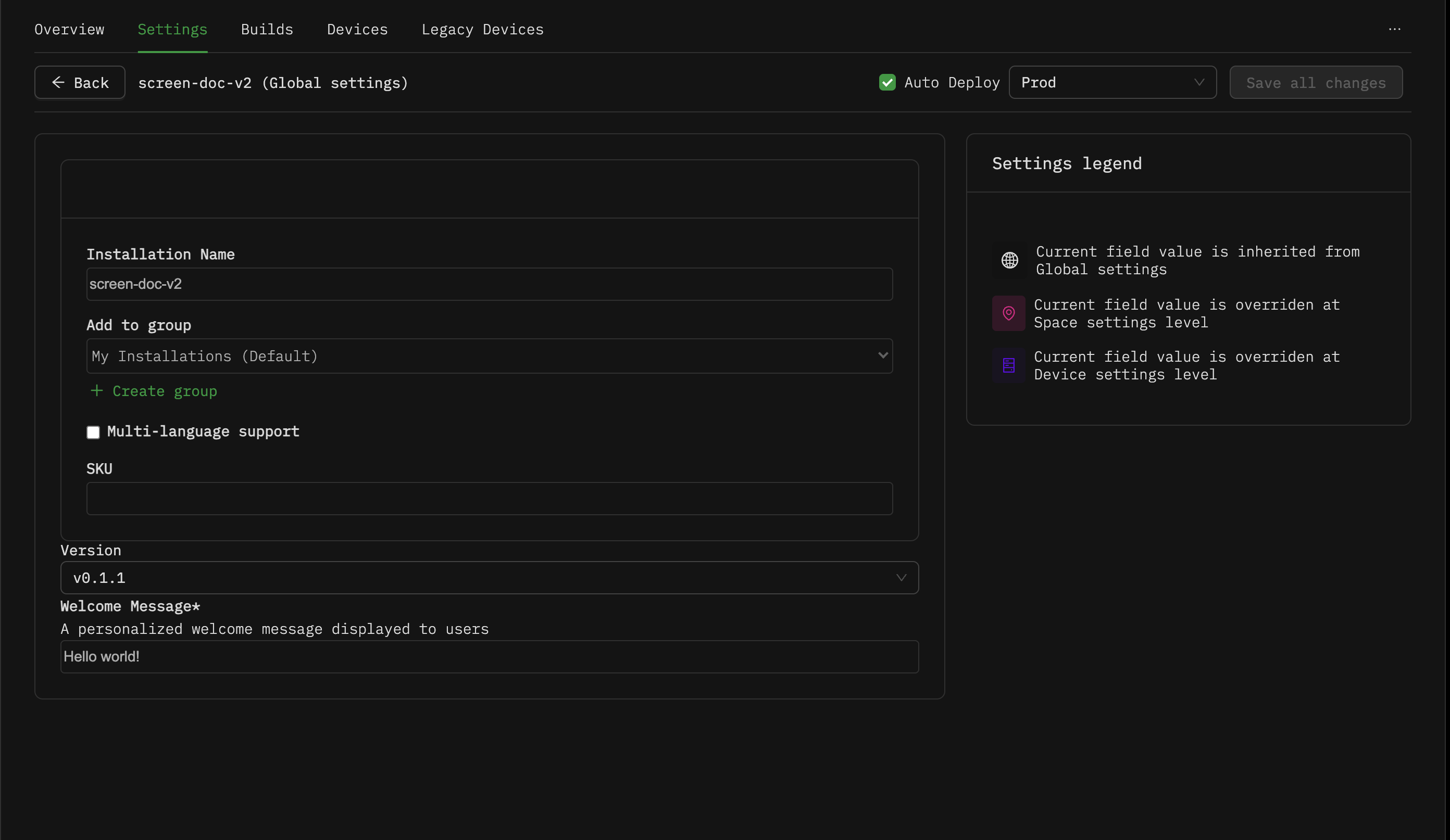
In this example, you can see how your schema.ts definition translates to the installation settings form:
- The
@titleannotation appears as the field label - The field shows an asterisk (*) because it's required in your schema
- The
@descriptionannotation displays as help text below the label - The
@defaultvalue is pre-filled in the input field - The form validates against your
@minLengthand@maxLengthconstraints, preventing invalid configurations from being saved
⚙️ Settings Overrides
Settings can be overridden at different levels to provide flexibility in configuration management:
- Device Level: Settings can be overridden for specific devices, allowing device-specific configurations
- Space Level: Settings can be overridden for specific spaces, enabling space-specific customizations
When your app is deployed to a Phygrid device, the platform automatically merges global, device, and space-level settings overrides to provide the correct configuration for that specific deployment.
Note: For more information about settings overrides, see the learn.phygrid.com documentation.
📝 Supported Types
🔤 String Type
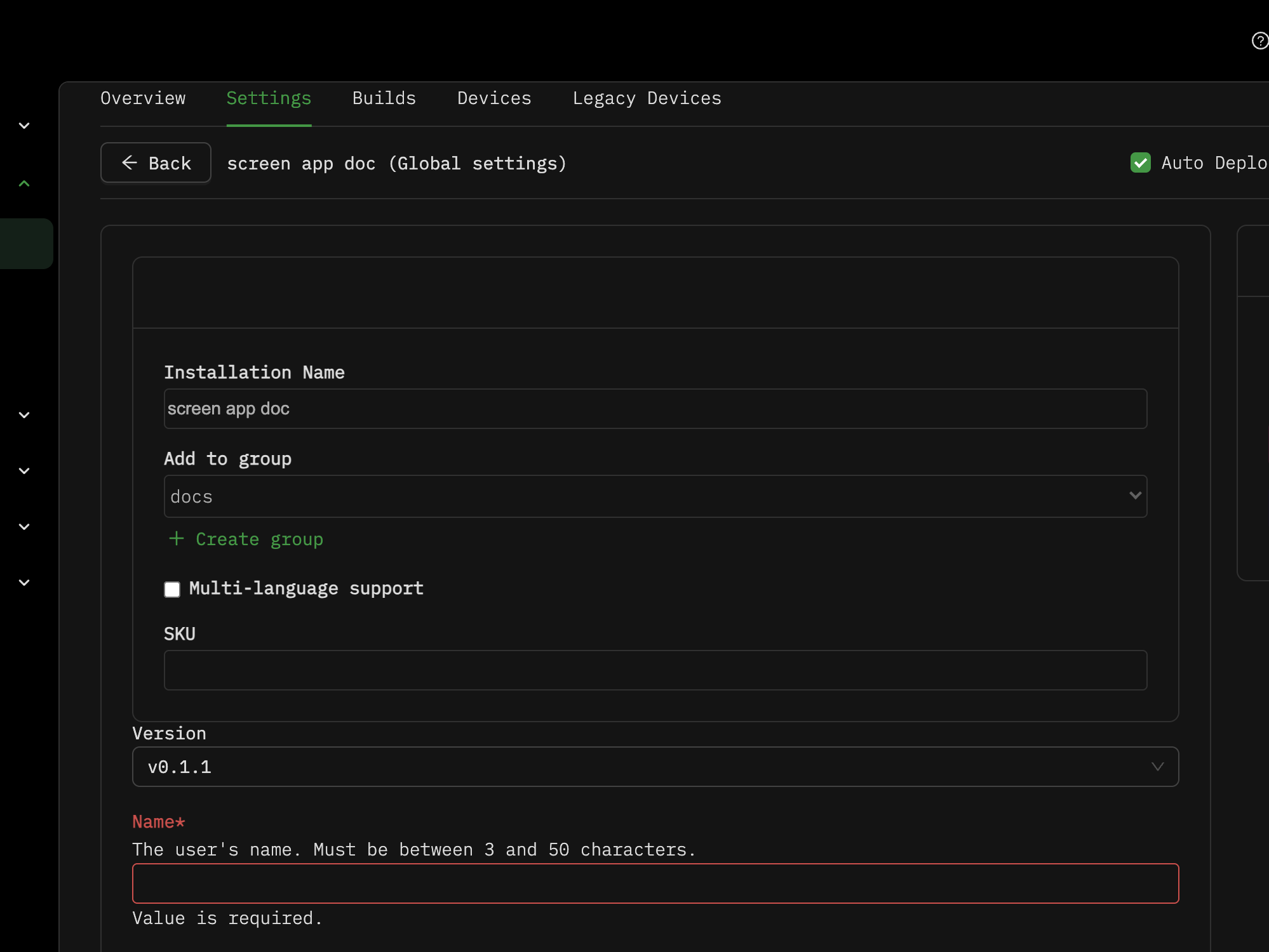
This example shows how to define a simple string setting with validation constraints such as minimum and maximum length.
schema.ts
export default interface Settings {
  /**
   * @title Name
   * @description The user's name. Must be between 3 and 50 characters.
   * @minLength 3
   * @maxLength 50
   */
  name: string
}
schema.json
{
  "schema": "http://json-schema.org/draft-07/schema#",
  "type": "object",
  "properties": {
    "name": {
      "type": "string",
      "title": "Name",
      "description": "The user's name. Must be between 3 and 50 characters.",
      "minLength": 3,
      "maxLength": 50
    }
  },
  "required": ["name"]
}- The
namefield represents a user-configurable string setting. - Validation constraints are added through the
@minLengthand@maxLengthannotations, ensuring the name is at least 3 characters and no longer than 50 characters.
🌍 Localized Field
This example shows how to define a localized string setting that supports multiple languages.
schema.ts
export default interface Settings {
  /**
   * @title Home page
   */
  homePage: {
    /**
     * @title Page title
     * @description Home page title
     * @ui multiLanguageText
     */
    title?: Record<string, string>
  }
}
schema.json
{
  "schema": "http://json-schema.org/draft-07/schema#",
  "type": "object",
  "properties": {
    "homePage": {
      "type": "object",
      "properties": {
        "title": {
          "type": "object",
          "title": "Page title",
          "description": "Home page title"
        }
      },
      "title": "Home page"
    }
  }
}
meta-schema.json
{
  "homePage": {
    "title": {
      "ui:field": "multiLanguageText"
    }
  }
}- The
titlefield accepts a record of language codes to localized strings. - The
@ui multiLanguageTextannotation enables a multi-language input interface.

✅ Boolean Type
This example shows how to define a boolean setting for true/false configurations.
schema.ts
export default interface Settings {
  /**
   * @title Notifications Enabled
   * @description Enables or disables notifications.
   */
  notificationsEnabled: boolean
}
schema.json
{
  "schema": "http://json-schema.org/draft-07/schema#",
  "type": "object",
  "properties": {
    "notificationsEnabled": {
      "type": "boolean",
      "title": "Notifications Enabled",
      "description": "Enables or disables notifications."
    }
  },
  "required": ["notificationsEnabled"]
}- The
notificationsEnabledfield accepts a boolean value (true or false). - This setting is typically rendered as a checkbox in the UI.

🔢 Number Type
This example demonstrates how to define a numeric setting with minimum and maximum value validations.
schema.ts
export default interface Settings {
  /**
   * @title Age
   * @description The age of the user. Must be between 18 and 120.
   * @minimum 18
   * @maximum 120
   */
  age: number
}
schema.json
{
  "schema": "http://json-schema.org/draft-07/schema#",
  "type": "object",
  "properties": {
    "age": {
      "type": "number",
      "title": "Age",
      "description": "The age of the user. Must be between 18 and 120.",
      "minimum": 18,
      "maximum": 120
    }
  },
  "required": ["age"]
}- The
agefield represents a numeric setting. - The
@minimumand@maximumannotations ensure the number falls within a specified range.

🔗 URL Type
This example shows how to define a URL as an optional setting with validation that ensures the input is a valid URI.
schema.ts
export default interface Settings {
  /**
   * @title Website
   * @description The user's personal website URL.
   * @format uri
   */
  website?: string
}
schema.json
{
  "schema": "http://json-schema.org/draft-07/schema#",
  "type": "object",
  "properties": {
    "website": {
      "type": "string",
      "title": "Website",
      "description": "The user's personal website URL.",
      "format": "uri"
    }
  }
}- The
websitefield is optional and accepts a string input that must be a valid URL. - The
@format uriannotation enforces URL validation.

📋 Enum / Dropdown List
This example illustrates how to define an enum setting to provide a dropdown selection of predefined options.
schema.ts
export default interface Settings {
  /**
   * @title Favorite Color
   * @description User's favorite color from a predefined list.
   * @enum ["Red", "Green", "Blue", "Yellow"]
   */
  favoriteColor: "Red" | "Green" | "Blue" | "Yellow"
}
schema.json
{
  "schema": "http://json-schema.org/draft-07/schema#",
  "type": "object",
  "properties": {
    "favoriteColor": {
      "type": "string",
      "enum": ["Red", "Green", "Blue", "Yellow"],
      "title": "Favorite Color",
      "description": "User's favorite color from a predefined list."
    }
  },
  "required": ["favoriteColor"]
}- The
favoriteColorfield limits user input to one of the predefined options. - The
@enumannotation lists all valid choices, which render as a dropdown in the UI.

📅 Date Type
This example shows how to define a date setting using a string with a date format.
schema.ts
export default interface Settings {
  /**
   * @title Birth Date
   * @description The user's birth date.
   * @format date
   */
  birthDate: string
}
schema.json
{
  "schema": "http://json-schema.org/draft-07/schema#",
  "type": "object",
  "properties": {
    "birthDate": {
      "type": "string",
      "title": "Birth Date",
      "description": "The user's birth date.",
      "format": "date"
    }
  },
  "required": ["birthDate"]
}- The
birthDatefield expects a string formatted as a date (YYYY-MM-DD). - The
@format dateannotation enforces that the input matches a valid date format.

📧 Email Type
This example shows how to define an email setting using a string with an email format.
schema.ts
export default interface Settings {
  /**
   * @title Email Address
   * @description User's email address.
   * @format email
   */
  email: string
}
schema.json
{
  "schema": "http://json-schema.org/draft-07/schema#",
  "type": "object",
  "properties": {
    "email": {
      "type": "string",
      "title": "Email Address",
      "description": "User's email address.",
      "format": "email"
    }
  },
  "required": ["email"]
}- The
emailfield accepts strings formatted as a valid email address. - The
@format emailannotation ensures input matches an email pattern.

🔒 Password Type
This example shows how to define a password setting using a string with a password format.
schema.ts
export default interface Settings {
  /**
   * @title Password
   * @description User password must be at least 8 characters.
   * @format password
   * @minLength 8
   * @pattern ^(?=.*[a-z])(?=.*[A-Z])(?=.*\d)(?=.*[@$!%*?&])[A-Za-z\d@$!%*?&]{8,}$
   */
  password: string
}
schema.json
{
  "schema": "http://json-schema.org/draft-07/schema#",
  "type": "object",
  "properties": {
    "password": {
      "type": "string",
      "title": "Password",
      "description": "User password. Must be at least 8 characters,
       At least one lowercase letter,
       one uppercase letter, one digit and one special character",
      "format": "password",
      "minLength": 8,
      "pattern": "^(?=.*[a-z])(?=.*[A-Z])(?=.*\\d)(?=.*[@$!%*?&])[A-Za-z\\d@$!%*?&]{8,}$"
    }
  },
  "required": ["password"]
}- The
passwordfield is a string with validation on minimum length. @format passwordhints UI to render as a password input (masked).@patternenforces the presence of:- At least one lowercase letter
- At least one uppercase letter
- At least one number
- At least one special character

📋 Array Type
This example shows how to define an array setting.
schema.ts
export default interface Settings {
  /**
   * @title Tags
   * @description List of tags associated with the item.
   */
  tags: string[]
}
schema.json
{
  "schema": "http://json-schema.org/draft-07/schema#",
  "type": "object",
  "properties": {
    "tags": {
      "type": "array",
      "items": {
        "type": "string"
      },
      "title": "Tags",
      "description": "List of tags associated with the item."
    }
  },
  "required": ["tags"]
}- The
tagsfield accepts an array of strings. - Useful for multi-select or lists of values.

🏗️ Object Type
This example shows how to define nested settings using object type.
schema.ts
export interface Address {
  /**
   * @title Street
   */
  street: string

  /**
   * @title City
   */
  city: string
}

export default interface Settings {
  /**
   * @title User Address
   */
  address: Address
}
schema.json
{
  "schema": "http://json-schema.org/draft-07/schema#",
  "type": "object",
  "properties": {
    "address": {
      "type": "object",
      "properties": {
        "street": {
          "type": "string",
          "title": "Street"
        },
        "city": {
          "type": "string",
          "title": "City"
        }
      },
      "required": ["street", "city"],
      "title": "User Address"
    }
  },
  "required": ["address"]
}- The
addressfield is a nested object with its own typed properties. - Enables grouping related settings.

🚀 Advanced Widgets
📷 Media Picker
This example shows how to define a media picker that allows users to select existing files from the tenant's media library or upload new media files.
schema.ts
type Media = {
  ref: "media"
  type: "image/png" | "image/jpg" | "image/jpeg"
  id: string
  url: string
}

export default interface Settings {
  /**
   * @title Profile Picture
   * @ui mediaPicker
   */
  profilePicture: Media
}
schema.json
{
  "schema": "http://json-schema.org/draft-07/schema#",
  "type": "object",
  "properties": {
    "profilePicture": {
      "type": "object",
      "properties": {
        "ref": {
          "type": "string",
          "const": "media"
        },
        "type": {
          "type": "string"
        },
        "id": {
          "type": "string"
        },
        "url": {
          "type": "string"
        }
      },
      "required": ["ref", "type", "id", "url"],
      "title": "Profile Picture"
    }
  },
  "required": ["profilePicture"]
}
meta-schema.json
{
  "profilePicture": {
    "ui:field": "mediaPicker"
  }
}- The
profilePicturefield enables users to select media files from the tenant's media library or upload new ones. - The
@ui mediaPickerannotation renders an interactive media selection component in the installation settings interface.

Fonts Picker
schema.ts
type FontType = "otf" | "font/otf" | "font/ttf" | "font/woff" | "font/woff2"

interface FontMedia {
  media?: {
    ref: "media"
    type: FontType
    id: string
    url: string
  }
}

interface Fonts {
  /**
   * @title Light
   */
  light?: FontMedia
  /**
   * @title Regular
   */
  regular?: FontMedia
  /**
   * @title Semi-bold
   */
  semiBold?: FontMedia
  /**
   * @title Bold
   */
  bold?: FontMedia
}

/**
 * @title Example schema
 */
export type Settings = {
  /**
   * @title Fonts
   */
  fonts: Fonts
}

export default Settings
schema.json
{
  "schema": "http://json-schema.org/draft-07/schema#",
  "type": "object",
  "properties": {
    "fonts": {
      "type": "object",
      "properties": {
        "light": {
          "type": "object",
          "properties": {
            "media": {
              "type": "object",
              "properties": {
                "ref": {
                  "type": "string",
                  "const": "media"
                },
                "type": {
                  "type": "string",
                  "enum": [
                    "otf",
                    "font/otf",
                    "font/ttf",
                    "font/woff",
                    "font/woff2"
                  ]
                },
                "id": {
                  "type": "string"
                },
                "url": {
                  "type": "string"
                }
              },
              "required": ["ref", "type", "id", "url"]
            }
          },
          "title": "Light"
        },
        "regular": {
          "type": "object",
          "properties": {
            "media": {
              "type": "object",
              "properties": {
                "ref": {
                  "type": "string",
                  "const": "media"
                },
                "type": {
                  "type": "string",
                  "enum": [
                    "otf",
                    "font/otf",
                    "font/ttf",
                    "font/woff",
                    "font/woff2"
                  ]
                },
                "id": {
                  "type": "string"
                },
                "url": {
                  "type": "string"
                }
              },
              "required": ["ref", "type", "id", "url"]
            }
          },
          "title": "Regular"
        },
        "semiBold": {
          "type": "object",
          "properties": {
            "media": {
              "type": "object",
              "properties": {
                "ref": {
                  "type": "string",
                  "const": "media"
                },
                "type": {
                  "type": "string",
                  "enum": [
                    "otf",
                    "font/otf",
                    "font/ttf",
                    "font/woff",
                    "font/woff2"
                  ]
                },
                "id": {
                  "type": "string"
                },
                "url": {
                  "type": "string"
                }
              },
              "required": ["ref", "type", "id", "url"]
            }
          },
          "title": "Semi-bold"
        },
        "bold": {
          "type": "object",
          "properties": {
            "media": {
              "type": "object",
              "properties": {
                "ref": {
                  "type": "string",
                  "const": "media"
                },
                "type": {
                  "type": "string",
                  "enum": [
                    "otf",
                    "font/otf",
                    "font/ttf",
                    "font/woff",
                    "font/woff2"
                  ]
                },
                "id": {
                  "type": "string"
                },
                "url": {
                  "type": "string"
                }
              },
              "required": ["ref", "type", "id", "url"]
            }
          },
          "title": "Bold"
        }
      },
      "title": "Fonts"
    }
  },
  "required": ["fonts"]
}
meta-schema.json
{
  "fonts": {
    "ui:field": "mediaPicker"
  }
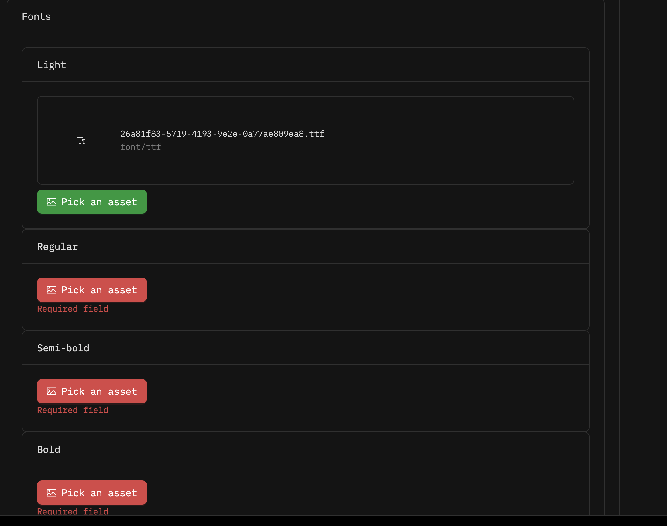
}- The
mediaPickerUI component allows users to upload font files in supported formats. - The
@mediaTypesdirective restricts uploads to specific MIME types (e.g.,font/ttf,font/woff2). - Once uploaded, these fonts can be referenced and applied throughout the application for consistent styling and branding.
🎨 Color Picker
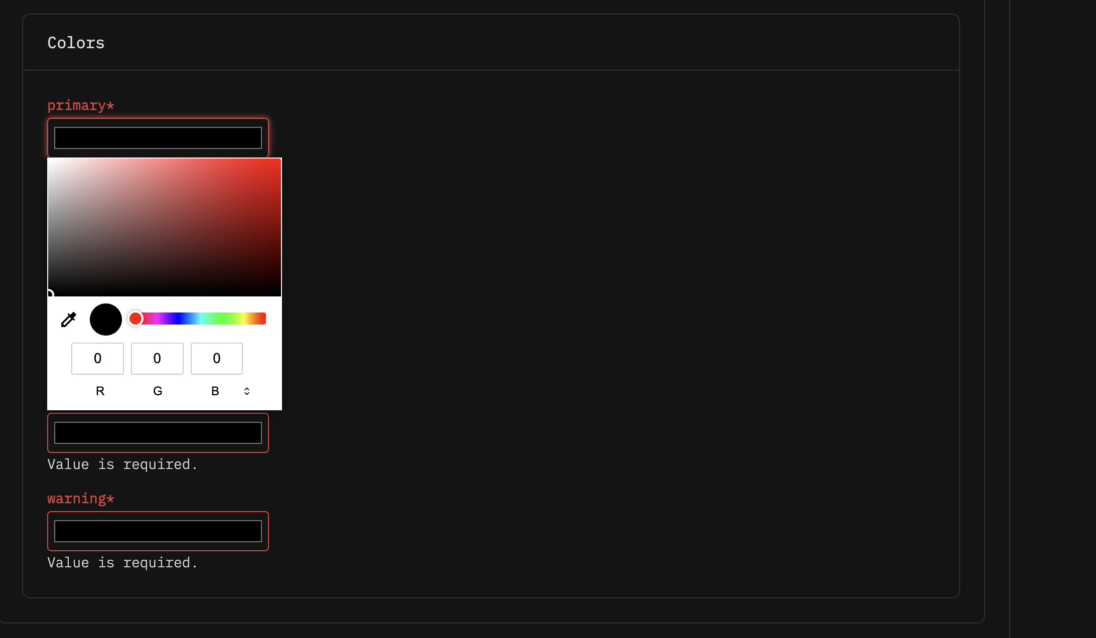
This example demonstrates how the settings schema enables users to configure color themes, allowing consistent branding throughout the application.
schema.ts
interface ThemeBaseColors {
  /**
   * @widget color
   */
  primary: string
  /**
   * @widget color
   */
  secondary: string
  /**
   * @widget color
   */
  error: string
  /**
   * @widget color
   */
  success: string
  /**
   * @widget color
   */
  warning: string
}

interface Theme {
  /**
   * @title Colors
   */
  colors: ThemeBaseColors
}

export type Settings = {
  /**
   * @title Theme settings
   */
  theme: Theme
}

export default Settings
schema.json
{
  "schema": "http://json-schema.org/draft-07/schema#",
  "type": "object",
  "properties": {
    "theme": {
      "type": "object",
      "properties": {
        "colors": {
          "type": "object",
          "properties": {
            "primary": {
              "type": "string"
            },
            "secondary": {
              "type": "string"
            },
            "error": {
              "type": "string"
            },
            "success": {
              "type": "string"
            },
            "warning": {
              "type": "string"
            }
          },
          "required": ["primary", "secondary", "error", "success", "warning"],
          "title": "Colors"
        }
      },
      "required": ["colors"],
      "title": "Theme settings"
    }
  },
  "required": ["theme"]
}
meta-schema.json
{
  "theme": {
    "colors": {
      "primary": {
        "ui:widget": "color"
      },
      "secondary": {
        "ui:widget": "color"
      },
      "error": {
        "ui:widget": "color"
      },
      "success": {
        "ui:widget": "color"
      },
      "warning": {
        "ui:widget": "color"
      }
    }
  }
}- The
ThemeBaseColorsinterface defines several color fields using the@widget colorannotation, which renders a color picker in the UI. - These fields allow users to select branding colors such as primary, secondary and error states.
- Once configured, these colors can be referenced and applied throughout the application for consistent styling and branding.
🛍️ Product Picker
Note: The product picker requires Products to be configured for your tenant. For more information, see Products Integration.
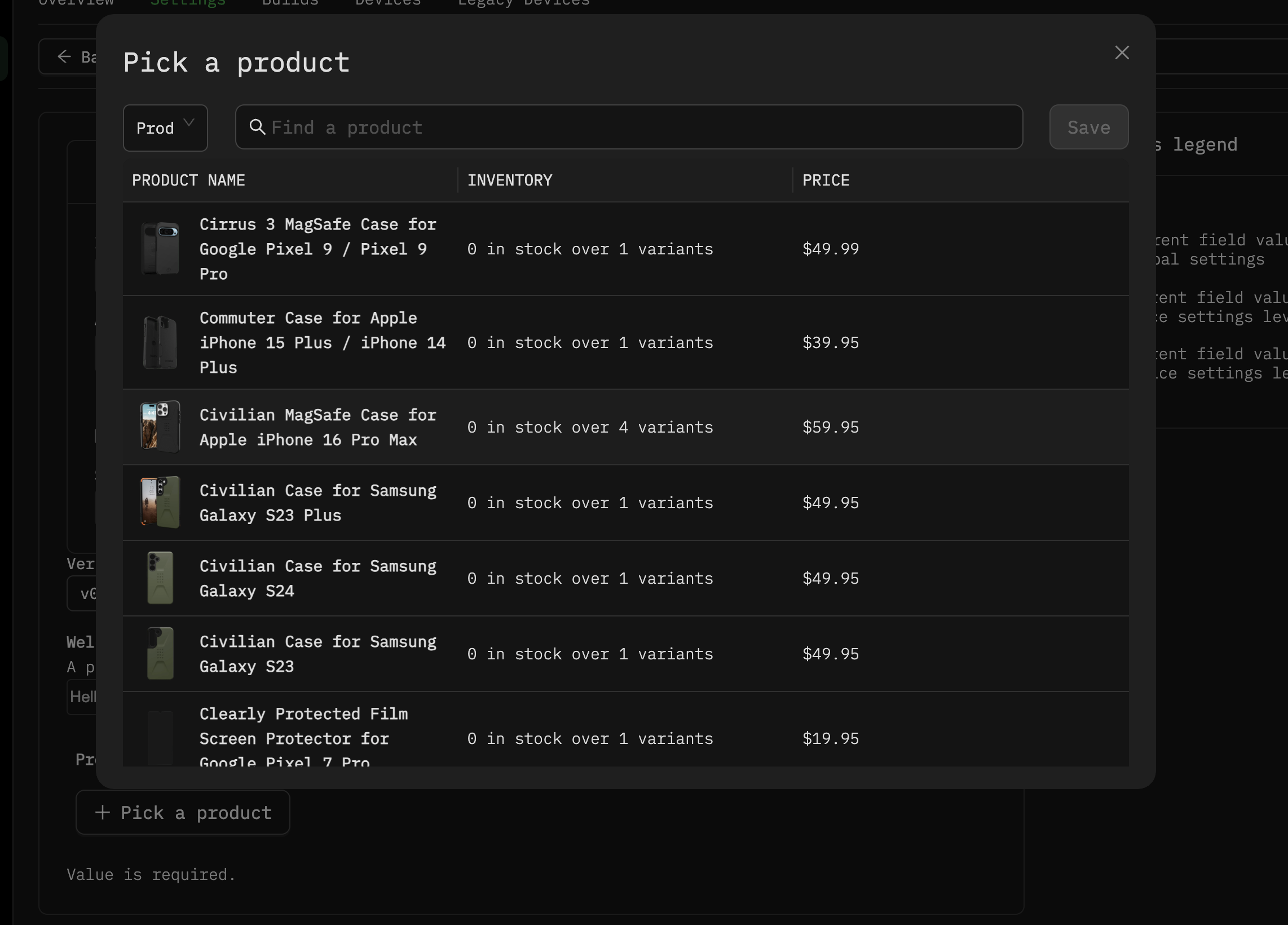
The product picker allows users to refer products from their tenant's catalog for use within their applications.
This enables retail applications, product displays, and e-commerce integrations to work with specific products and their associated data.
schema.ts
interface Product {
  ref: "grid-product"
  productGroupId: string
  productId: string
  defaultImage: string
  productSourceUrl: string
  env: string
}

export default interface Settings {
  /**
   * @title Product
   * @description Select a product from your Grid catalog.
   * @ui productPicker
   */
  product: Product
}
Generated schema.json
{
  "schema": "http://json-schema.org/draft-07/schema#",
  "type": "object",
  "properties": {
    "product": {
      "type": "object",
      "properties": {
        "ref": {
          "type": "string",
          "const": "grid-product"
        },
        "productGroupId": {
          "type": "string"
        },
        "productId": {
          "type": "string"
        },
        "defaultImage": {
          "type": "string"
        },
        "productSourceUrl": {
          "type": "string"
        },
        "env": {
          "type": "string"
        }
      },
      "required": ["ref", "productGroupId", "productId", "defaultImage", "productSourceUrl", "env"],
      "title": "Product",
      "description": "Select a product from your Grid catalog."
    }
  },
  "required": ["product"]
}
Generated meta-schema.json
{
  "product": {
    "ui:field": "productPicker"
  }
}- The
productPickerUI component displays all available products from your tenant's catalog - The selected product reference can be used within your app alongside the Products SDK to fetch detailed product information
Example Use Cases:
- Product Displays: Selecting a product to show on digital signage or kiosks
- Product Recommendations: Displaying related products based on selection

🔧 Twin/Peripheral Picker
The twin picker allows users to select any twin within their tenant, enabling powerful integration scenarios between different components in your Phygrid environment.
A common use case is selecting peripheral twins such as barcode scanners, printers, or other hardware devices connected to your system.
The twin picker supports filtering options to display only relevant twins based on their type and descriptors.
Learn More: For detailed information about twins, peripherals and descriptors, see Peripherals & Descriptors.
schema.ts
interface TwinPicker {
  id: string
  ref: "twin"
}
export default interface Settings {
  /**
   * @title Barcode Scanner
   * @description Select a barcode scanner peripheral twin.
   * @ui twinPicker
   * @uiOptions {
   * "twinTypes":["Peripheral"],
   * "twinDescriptors":["phygrid/barcodescanner"]
   * }
   */
  barcodeScanner?: TwinPicker

  /**
   * @title Receipt Printer
   * @description Select a printer peripheral for receipt printing.
   * @ui twinPicker
   * @uiOptions {
   * "twinTypes":["Peripheral"],
   * "twinDescriptors":["phygrid/printer"]
   * }
   */
  receiptPrinter: TwinPicker
}
schema.json
{
  "schema": "http://json-schema.org/draft-07/schema#",
  "type": "object",
  "properties": {
    "barcodeScanner": {
      "type": "object",
      "properties": {
        "id": {
          "type": "string"
        },
        "ref": {
          "type": "string",
          "const": "twin"
        }
      },
      "required": ["id", "ref"],
      "title": "Barcode Scanner",
      "description": "Select a barcode scanner peripheral twin."
    },
    "receiptPrinter": {
      "type": "object",
      "properties": {
        "id": {
          "type": "string"
        },
        "ref": {
          "type": "string",
          "const": "twin"
        }
      },
      "required": ["id", "ref"],
      "title": "Receipt Printer",
      "description": "Select a printer peripheral for receipt printing."
    }
  },
  "required": ["barcodeScanner", "receiptPrinter"]
}
meta-schema.json
{
  "barcodeScanner": {
    "ui:field": "twinPicker",
    "ui:options": {
      "twinTypes": ["Peripheral"],
      "twinDescriptors": ["phygrid/barcodescanner"]
    }
  },
  "receiptPrinter": {
    "ui:field": "twinPicker",
    "ui:options": {
      "twinTypes": ["Peripheral"],
      "twinDescriptors": ["phygrid/printer"]
    }
  }
}- The
peripheralPickerUI component allows users to select from available twins in their tenant twinTypesandtwinDescriptorsfilter the selection to specific twin categories- Once configured, the app can establish connections and communicate with selected twins using Hub Client
Example Use Cases:
- Retail Kiosks: Connect barcode scanners and receipt printers

💳 Payment Picker
Note: The payment picker requires Checkout to be configured for your tenant. For more information, see Checkout Integration.
The payment picker allows users to configure payment methods for their applications, supporting both online and card-present payment modes. This is useful for retail, e-commerce, and point-of-sale applications that need to process transactions.
The payment picker displays available payment options based on the methods and modes configured for your tenant.
Supported Payment Modes:
- Online Payments: For e-commerce and remote transactions
- Card Present: For in-store terminals and physical card readers
schema.ts
type OnlinePaymentData = {
  collectShippingAddress: boolean
}

type CardPresentPaymentData = {
  terminalId: string
}

interface PaymentMethod {
  id: string
  title: string
  mode: "online" | "cardPresent"
  type: "adyenCloudCardTerminal" | "stripeOnlineCheckout"
  data: OnlinePaymentData | CardPresentPaymentData
}

export default interface Settings {
  /**
   * @title Payment Method
   * @description Choose one or more supported payment modes.
   * @ui paymentMethodPicker
   * @uiOptions {
   *   "mode": ["online", "cardPresent"]
   * }
   */
  paymentMethod: PaymentMethod
}
schema.json
{
  "schema": "http://json-schema.org/draft-07/schema#",
  "type": "object",
  "properties": {
    "paymentMethod": {
      "type": "object",
      "properties": {
        "id": {
          "type": "string"
        },
        "title": {
          "type": "string"
        },
        "mode": {
          "type": "string"
        },
        "type": {
          "type": "string"
        },
        "data": {
          "type": "object"
        }
      },
      "required": ["id", "title", "mode", "type", "data"],
      "title": "Payment Method",
      "description": "Choose one or more supported payment modes."
    }
  },
  "required": ["paymentMethod"]
}
meta-schema.json
{
  "paymentMethod": {
    "ui:field": "paymentMethodPicker",
    "ui:options": {
      "mode": ["online", "cardPresent"]
    }
  }
}- The
paymentMethodPickerUI component presents available payment methods for selection - The
@uiOptionsdirective filters available payment types based on payment modes - Once configured, the app can use the selected payment method to process transactions
Example Use Cases:
- Retail Kiosks: Configure card terminals for in-store payments
- E-commerce Apps: Set up online payment gateways like Stripe
- Hybrid Solutions: Support both online and in-person payment methods

🏢 Space Picker
The space picker allows users to select a specific space from their tenant.
While apps typically operate within the context of their device's space, this picker enables access to other spaces data when needed for cross-location functionality.
schema.ts
interface SpacePicker {
  id: string
  externalId?: string
  valid?: boolean
}

export default interface Settings {
  /**
   * @title Space Picker
   * @description Select a specific space for location-based configuration.
   * @ui spacePicker
   */
  spacePicker: SpacePicker
}
schema.json
{
  "schema": "http://json-schema.org/draft-07/schema#",
  "type": "object",
  "properties": {
    "spacePicker": {
      "type": "object",
      "properties": {
        "id": {
          "type": "string"
        },
        "externalId": {
          "type": "string"
        },
        "valid": {
          "type": "boolean"
        }
      },
      "required": ["id"],
      "title": "Space Picker",
      "description": "Select a specific space for location-based configuration."
    }
  },
  "required": ["spacePicker"]
}
meta-schema.json
{
  "spacePicker": {
    "ui:field": "spacePicker"
  }
}- The
spacePickerUI component presents available spaces from the user's tenant
Example Use Cases:
- Endless Aisle: Different online stock data per store location

📋 Queue Picker
Note: The queue picker is part of Phygrid's Queue Management solution. For more information about queue system functionality, visit learn.phygrid.com.
The queue picker allows users to select a specific queue from their tenant, enabling access to queue-specific data and customization options.
This picker is designed for applications that integrate with Phygrid's visitor management ecosystem, including Queue Management and Appointment Booking solutions.
schema.ts
interface QueuePicker {
  /**
   * @title Queue ID
   */
  queueId: string

  /**
   * @title Organisation name
   */
  organization: string

  /**
   * @title Queue endpoint
   */
  queueEndpoint: string
}

export default interface Settings {
  /**
   * @title Queue
   * @description Select a queue for data management and visitor tracking.
   * @ui queuePicker
   */
  queue: QueuePicker
}
schema.json
{
  "schema": "http://json-schema.org/draft-07/schema#",
  "type": "object",
  "properties": {
    "queue": {
      "type": "object",
      "properties": {
        "queueId": {
          "type": "string",
          "title": "Queue ID"
        },
        "organization": {
          "type": "string",
          "title": "Organisation name"
        },
        "queueEndpoint": {
          "type": "string",
          "title": "Queue endpoint"
        }
      },
      "required": ["queueId", "organization", "queueEndpoint"],
      "title": "Queue",
      "description": "Select a queue for data management and visitor tracking."
    }
  },
  "required": ["queue"]
}
meta-schema.json
{
  "queue": {
    "ui:field": "queuePicker"
  }
}- The
queuePickerUI component displays all available queues within the tenant for selection - Once selected, the queue's endpoint enables real-time data retrieval and queue status updates
Example Use Cases:
- People Counter: Assigning a queue to count people entering/exiting a space
- Occupancy Signage: Linking to a queue that tracks capacity in real time
- Queue Kiosk: Letting users choose a service queue when arriving at a kiosk

🔄 Next Steps
Now that you understand settings schemas, you can: